Change at a Distance
The intersection of social change with mass user engagement with live streaming
Spireworks is a platform that allows people to change the lights of iconic NYC skyscrapers. It provides an edge lighting server, a mobile application, and a management suite for property owners that streamlines and automates installation lighting operations.
We decided to leverage the company’s previous experiences with raising money for important world causes like Save the Children and the Australian Wildfire Fund. If you donate money, you get to control the lights. The founder hoped that now everyone was under lockdown, people could unite under a single cause by raising money for Global Giving’s Coronavirus Relief Fund while adding a little magic to their lives.
Role: Product Strategy, Wireframing, User Flow, Brand Strategy, Copywriter (social media, email, press, website)
The Ask: Design a streaming site
I broke this up into steps:
Addressed the needs of 4 different kinds of users (members of Spirework’s invite-only app, aspiring members of Spireworks, people considering pay-to-play and using pay-to-play, and completely new visitors who have never even heard of Spireworks).
Helped users feel engaged and connected throughout the site
Explained the process of how to download the app, make an account as a guest, donate, and then control the lights.
The Problem
A live stream site of a building can look pretty boring. There’s no particular audio, no interesting camera angles, etc. and a live stream site in and of itself isn’t too inspiring/compelling. We already know the basic components of a video website stream design - a big box with a play/stop button and an option to make it full screen but how do we make it great?
The Solution
I wanted to build in features that would create a sense of “togetherness” and joy
(Part 1) Audience Interaction:
I wanted to figure out how to make the streaming site ENGAGING and I started off with a lot of competitive research: Instagram Live, TikTok, Facebook Live, YouTube, Twitch to see what interactions were possible on a streaming site.
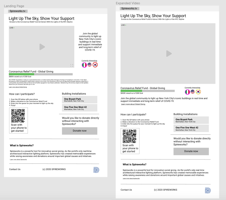
The original plan was to have the name of the users controlling the spires at the moment along with the color they wanted the spire to be. Part of my concern with the live stream experience was that users wouldn’t really feel the same degree of satisfaction when changing the spire as they would when they changed the lights in person.
Although this initial wireframe was given the green light by the client & the client’s parent company, after talking it over with the client, we realized it didn’t make sense for users who donated to be named and decided that we could bring a feeling of “global togetherness” by having the name of the user’s country along with their selected colors instead.
(Part 2) Progress Bar:
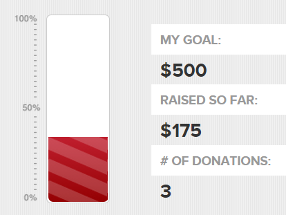
A huge part of the experience is raising money for a good cause. I decided to include a status bar so people would understand how much money was being raised and how they and others are contributing.
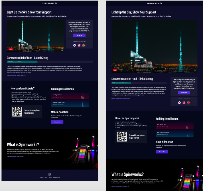
The final lo-fi wireframe!
The Result:
We gained $50K in donations and the company got a decent amount of press coverage.


